Katrina Cleary
Food Stylist
Food Stylist
Brand strategy, visual and verbal language, social media and printed collateral
Approach
Katrina Cleary required an identity that would solidify her position in the food industry as one of Melbournes best food stylists.
Brief
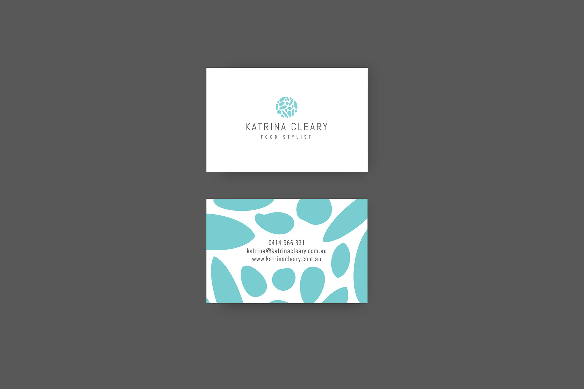
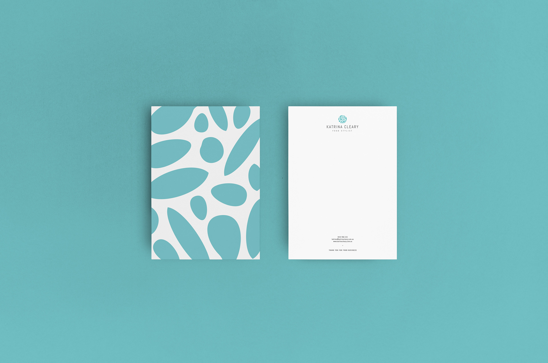
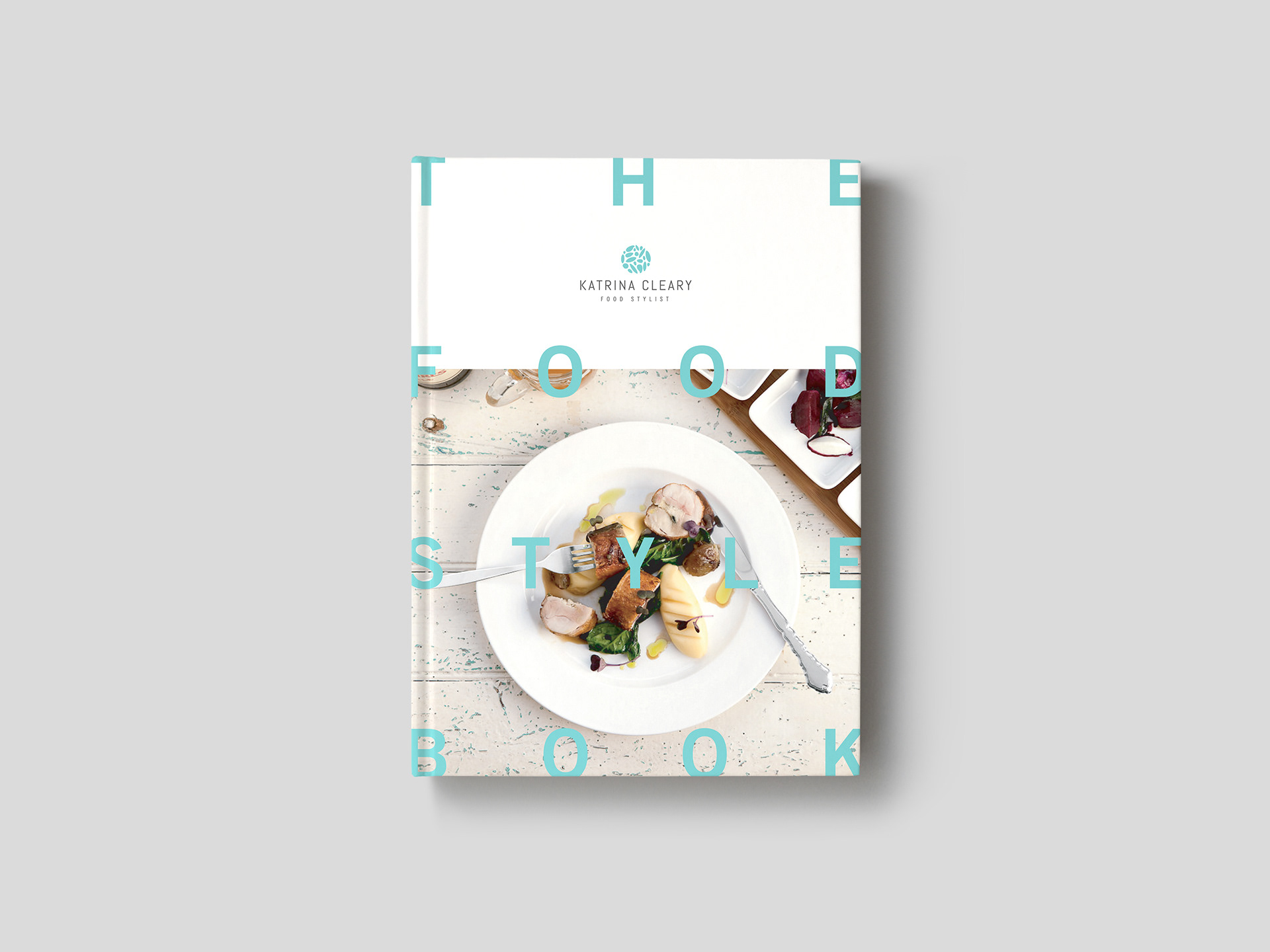
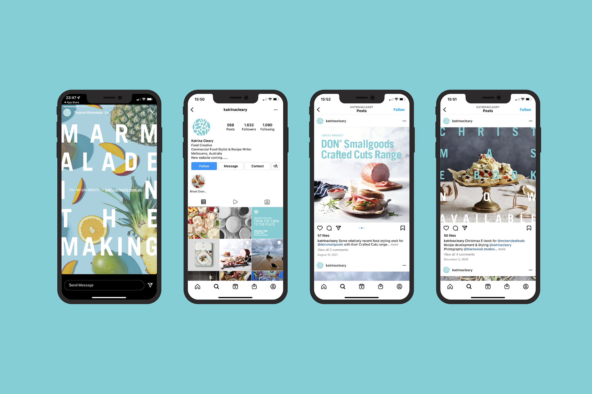
A graphic style embedded with a sense of freshness was the key to Katrina's brand. Designed to frame and enhance her photography with subtle details and information.
Visual identity
What resulted is an instantly recognisable, playful and approachable brand. The logo is inspired by raw ingredients, seeds and grains styled into a round form synonymous with the culinary industry, which also serves as a versatile pattern.. A soft colour palette has been introduced to offset Katrina’s vibrant imagery and delectable ingredients.